Willie these are wonderful! Hey also got my October HOW magazine yesterday - congrats on the "Rough Weather" piece. It grabbed my eye right away, then I smiled when I saw your name. Very cool piece!
Dang, WB -- you're in HOW? You are, to quote ZZ Top, "Nationwide."
I hope you remember us who knew you when...
;-)
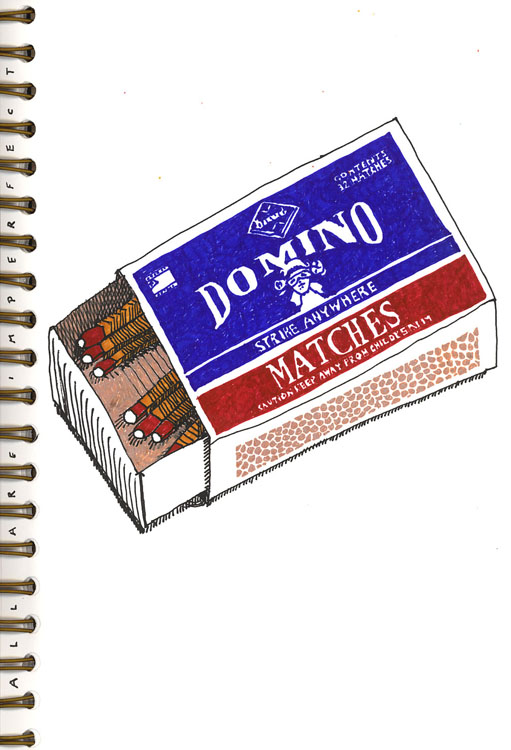
Anyway, these matches are matchless. I love the rural Americana feeling of the Domino matches, and I love the burnt fun of the match cross. And both make me want to fire up a grill.
Sorry haven't commented lately, it's been a tad overloady at work so it's all I can do to hang on and post new schtuff.
Bth are great, Willie. I admire the top one for its detail and feeling of texture, and heck..the bottom one too! No perfect matches, but very fine drawings!


Well done drawing!
ReplyDeleteDig both drawings... hope you really set fire to the paper for number two :-)
ReplyDeletewow.. thats really nice.
ReplyDeleteI love love love this.
ReplyDeletelike them both...
ReplyDeleteVery nice, both!
ReplyDeleteLove the second pic the best - very funny!
ReplyDeletewow, nicely drawn!
ReplyDeleteVery good! I like both :) A good message too ;)
ReplyDeleteLooks like a perfect match to me....action and results. Clever of you.
ReplyDeleteThese are both wonderful.
ReplyDeleteGood job.
Keep those away from my cupcakes, dude!
ReplyDeleteSmooch,
The Tart
; *
truly love it. the first one. the second one is more of a slow burn....
ReplyDeletetrust willie to make us smile!
lovely,
susan
willie,
ReplyDeletei've become quite attached
to your blog and this week's match.
You think in ways I love to see:
in every way creatively.
Thanks for the poem from you to me
I enjoyed it thoroughly
And just in case you might not know:
Your work is awesome, not so-so.
:)
matches at rest, matches at play works for me
ReplyDeleteFabulous. I love your attention to detail.
ReplyDeleteexcellent! i love them both!!!
ReplyDeleteHey Man --- You burned a hole in my monitor!!
ReplyDeleteKnock off this damn realism, WillieBoy!
WOW Willy I love'em both! Cool as always.
ReplyDeleteThese are great! Nothing like a literal translation now and then.
ReplyDeleteNice!!
ReplyDeleteMy favourite is the first! Love the hidden message.
ReplyDeleteAwsome Willie,
ReplyDeleteI love both of them,.the second is so D*** cool! Love the message behind your creativity!
seeya soon
S
really cool and nicely drawn.
ReplyDeleteThat's hot.
ReplyDeletevery nice drawings! cool!
ReplyDeleteGreat!!
ReplyDeleteFire!!!!!!!!!!!!!!!!!!!!!!!!!
See you
the second one is perfect...love it
ReplyDeleteAhhhhh Willie!!!! you are the best as usual!!!
I love these so much.
ReplyDeleteI like the first one also. I was thinking of doing a similar thing ;)
ReplyDeleteLove them both, but the seond one more....
ReplyDeleteOh, I really love them both, especially the one with the burnt edge. Wish I'd thought of that! Your drawings have a great graphic quality.
ReplyDeleteI'm glad you posted both and your line about the perfect match. Your drawing is is so flavorful and juicy!
ReplyDeleteWow! I love the style of the top illo. Super cool.
ReplyDeletelove
love the second one. There is something about drawings coming to life or the representation of that, that really appeals to me. Excellent
ReplyDeletelet me decide for you ;)
ReplyDeletethe bottom one is definetely the best...i tried too such burning experiments and it was difficult to "drive" the flame...
Willie these are wonderful! Hey also got my October HOW magazine yesterday - congrats on the "Rough Weather" piece. It grabbed my eye right away, then I smiled when I saw your name. Very cool piece!
ReplyDeleteDang, WB -- you're in HOW? You are, to quote ZZ Top, "Nationwide."
ReplyDeleteI hope you remember us who knew you when...
;-)
Anyway, these matches are matchless.
I love the rural Americana feeling of the Domino matches, and I love the burnt fun of the match cross. And both make me want to fire up a grill.
Sorry haven't commented lately, it's been a tad overloady at work so it's all I can do to hang on and post new schtuff.
both are fabulous!!!
ReplyDeletecool !!! the second one ;-))))
ReplyDeleteI like the second one the best. Seems mythic some how.
ReplyDeletemm... FIRE FIRE FIRE!
ReplyDeletei like them both a lot. the colors and i love the clean lines.
I love the pics but I believe in perfect matches...just look at mom and dad!
ReplyDeleteVery nice matches. I like them both!
ReplyDeleteI hope you made the perfect fire with your No such perfect match.
ReplyDeleteBth are great, Willie. I admire the top one for its detail and feeling of texture, and heck..the bottom one too! No perfect matches, but very fine drawings!
ReplyDeleteI liked the matches, specially the one at the bottom.
ReplyDeleteSalud!
Both really cool drawings but I especially like the top one - have you ever seen David Shrigley's work? I have a feeling you might enjoy it :)
ReplyDeletelove that top one - very interesting the way the black-outlined matches work with the no-outlines box face
ReplyDeleteWow. Love the look of the first and the concept of the second.
ReplyDeleteDid you use marker for the colour? What size is the work? I'm just curious about the scale because it could work as a tiny or a large drawing.
These are both great! The top one looks pretty close to perfect to me!
ReplyDeletei like them both but the second one is brilliant… almost as if the horizontal match was too impatient
ReplyDeletelove the one with the burn- mixing 2d with 3d- brilliant!
ReplyDeleteI like them both but I LOVE the bottom one! It's clever, simple but overflowing with meaning. LOVE it!
ReplyDelete(p.s. i drew a ladder last week, hoping it would give you a bit of a thrill, hehehehe)
Striking imagagery!
ReplyDeleteI really like both of them. You have a very appealing rendering style.
ReplyDeletedid i ever tell you that that match box is the coolest.
ReplyDelete